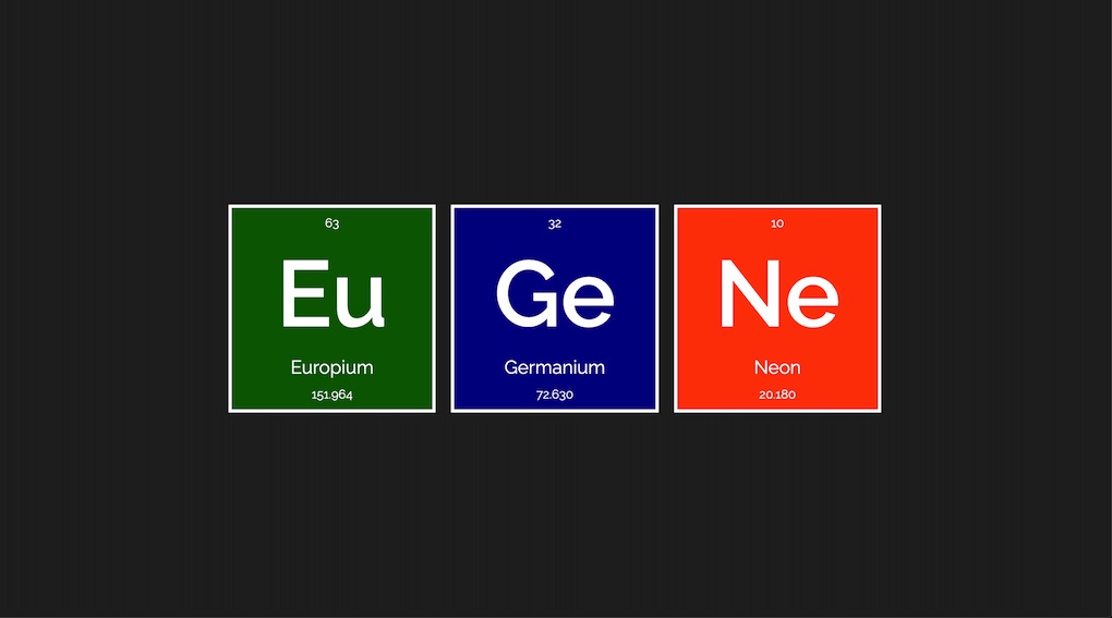
Eugene's Elements
I always liked the way the period table looks, it's so well
organised. One day I wondered if I could make up my name with some
of the elements. The number at the top of each card is the atomic
number, whereas the one at the bottom is the atomic weight. Click on
each card to learn more. I used flexbox to arrange the cards and the
elements within. To make it mobile friendly I mainly edited the
direction of flex. I often like to use css named colours since they
are easier to remember. This page features medium sea green,
cornflower blue and yellow. Font
Raleway.
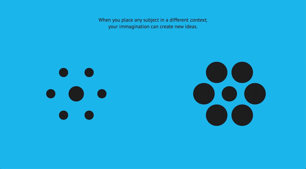
Context
Context plays such a major part in the creative process. The
"adjust" part of the
Scamper
creative thinking technique illustrates this concept. The circles in
the middle are identical but because they are placed in different
context they make us think otherwise. They say "there is no such
thing as a bad idea but an idea applied to the wrong problem". The
circles live over a css grid and adjust to the width of the
page. Font
PT Sans
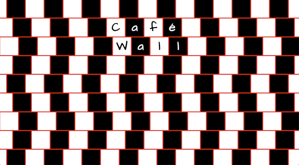
Café Wall
I once bumped into a building in the back streets of
Camden Town
which featured tiles on the ground floor arranged in this manner. I
later found out reading
Thinkertoys
that it is actually a visual illusion called "Café Wall". The
Wikipedia page
shows also a building with such pattern and that's where I got the
orange from. I used css flexbox on each row individually and shifted
them with some negative margin. To make it work on mobile I just
rotated the whole thing by 90' degees and hid/shown the caption
accordingly. Font
Architects Daughter.
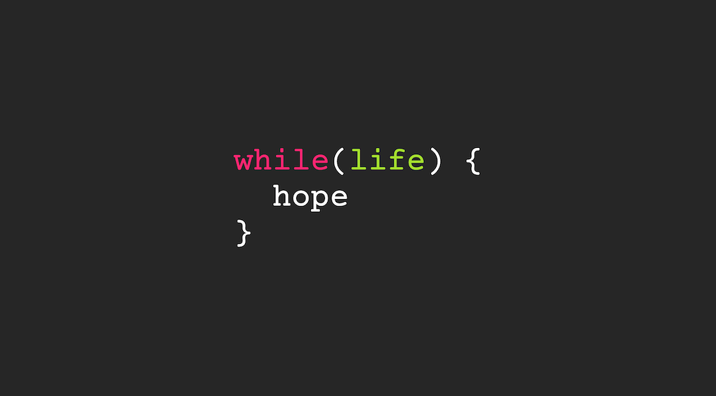
While Life Hope
Sometimes we need to be reminded that as long as there is life there
is hope. I wanted to combine this quote with a basic conditional
statement that can be applied to many programming languages. I've
seen similar concepts on t-shirts and other merchandise but I wanted
to make my own one. The colour palette comes from the Monokai theme
on Visual Studio Code editor, font
Courier Prime
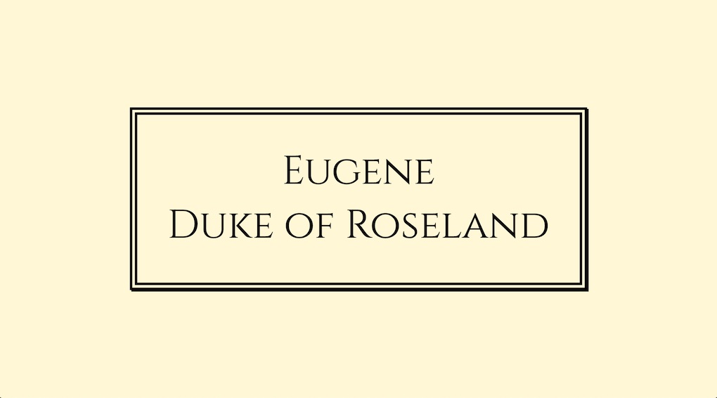
Duke of Roseland
As soon as I saw the
Cinzel font
I thought it looked very regal. Since I don't expect any time soon
to be crowned king, I settled for the title of duke (self-assigned
of course).
The Roseland
is one of my favourite places ever in Cornwall. I also used a double
border and a box shadow. Colour cornsilk, coincidently enough.
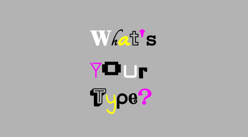
What's Your Type?
This is one of my favourites. I thought it would be easier to put
together 15 different font families; far from it. I got the idea
from the
"Just My Type" book. Click each letter to learn what font I used.
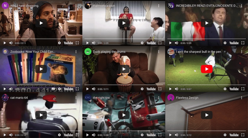
Over Entertainment
Do you ever feel like you've been over entertained? Social media,
billboards, tv, the internet, music at any venue, radio in the car,
etc. Or indeed you over entertain yourself by watching silly YouTube
videos? I used css grid to put the iframes in place and had to find
videos about 10 seconds long in order not to be too demanding of the
data fetch. Enabling autoplay was key to delivering the message.
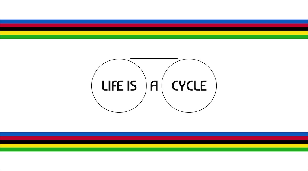
Life Is A Cycle
Whilst hearing about cycling events on the news lately, I noticed
this traditional colour palette. I've been meaning to make something
with it for a while since it reminds me of my childhood for some
reasons. I then had to think about something that cycles and if it's
true that we pretty much do the same things every day and every
other length of time, life is a cycle! It was also convenient to
apply a simple rotating animation, mimicking the spinning wheels of
a bicycle. The bands of colours live in flexbox rows as I prefer
that to design assets. Font
Baumans
was round enough to fit the theme.
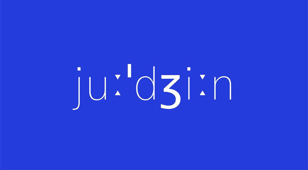
Judgin
I was intrigued by the way the
phonetic transcription
of my name looked. I liked how it features two long suprasegmentals
(the little triangles) and how the postalveolar resembles a number
3. After I drafted it, I came across a
blueprint
and thought the colour palette and thin font weight would go well
together. Font
Gothic A1.
Donuts Memory Game
Memory card game inspired by
Tania Rascia's version.
Themed with
donuts from Unsplash
with credits in each file name. Font
Baloo Bhai 2.
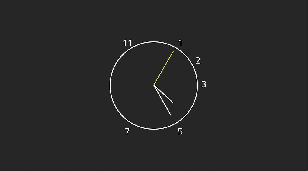
Prime Time
Here's an analog clock showing only
prime numbers. The actual mechanism comes from the
Wes Bos Javascript 30 clock exercise. The numbers live within an underlying css grid. Font
Titillium Web
partly chosen because it's designed by some compatriots at the
Accademia di Belle Arti di Urbino, who happen to have an awesome website.
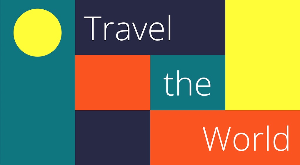
Travel the World
Inspired by the logo of the website for
Visit Lisboa, the capital of
Portugal. Font
Open Sans.
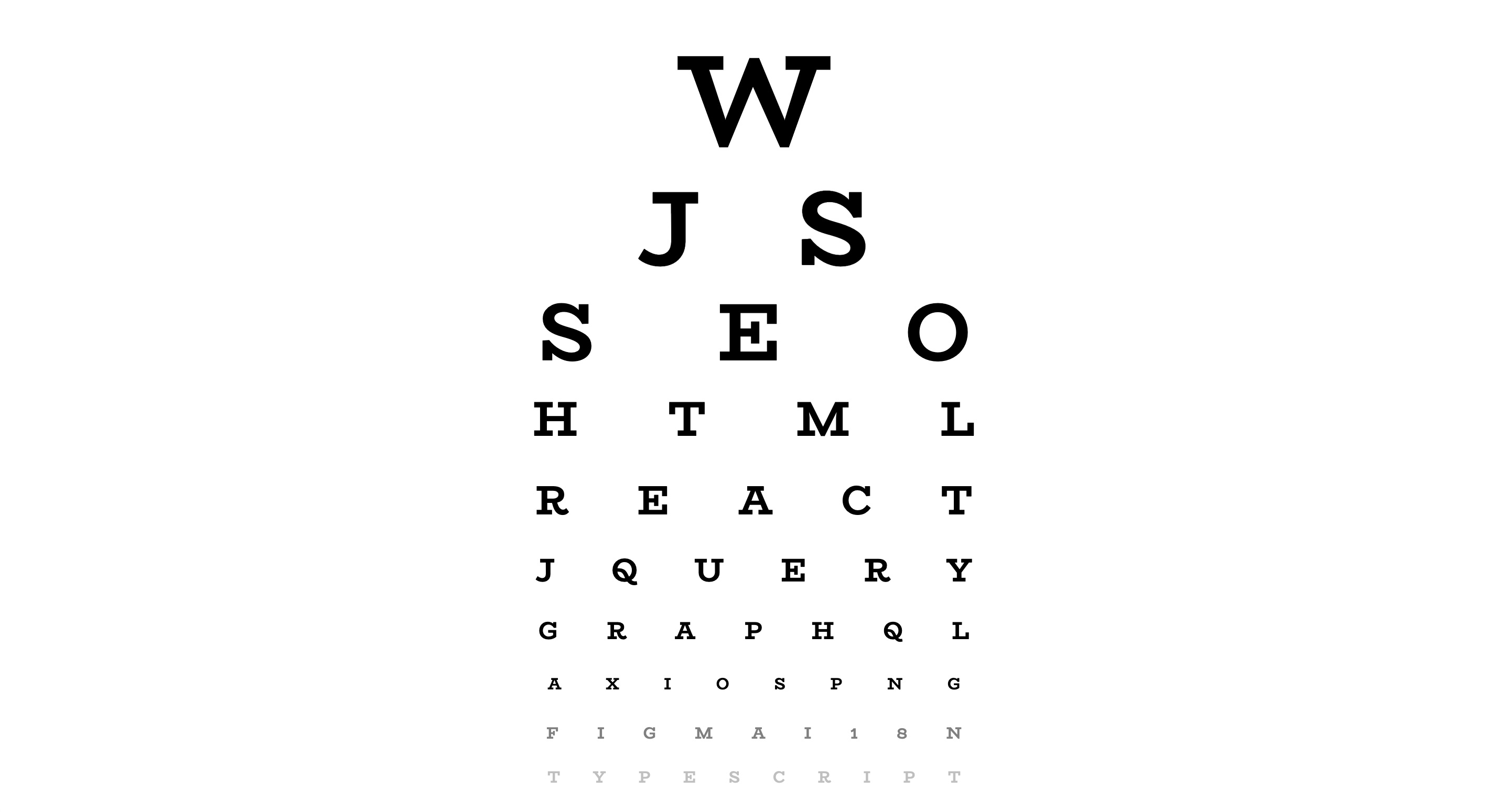
Web Eye Test
I'm sure someone else has come up with this idea before but I wanted
to make my own version. It was a little time consuming to get the
proportions right. I also had to find a way to center align the
letters on each row as the extra letter spacing would add space to
last letter as well.
Font BioRhyme.
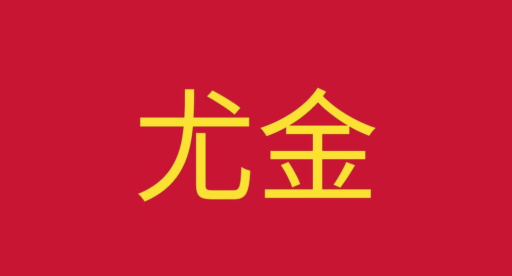
Chinese Eugene
Have you ever wondered how your name looks like in Chinese
characters? and in the
colours of the Chinese flag? Here's mine, I just used
Google translate. There were not many Google fonts for Chinese though but I did
find
Noto Sans TC.
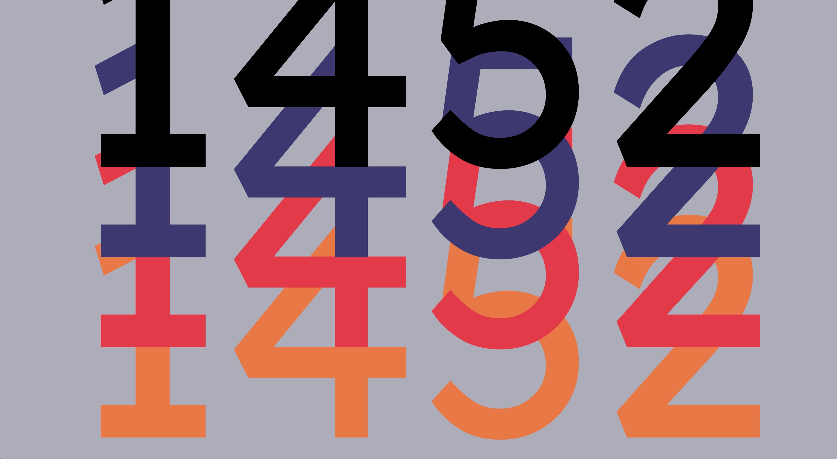
Numbers Stack
I was considering to learn to do card tricks, just for the sake of
doing something cool with my hands away from the screen. Whilst
browsing a website I bumped into the
45s Playing Cards. Then just by adding 1 and 2 at either end, I made up the year of
birth of
Leonardo da Vinci.
Lexend Deca font family.
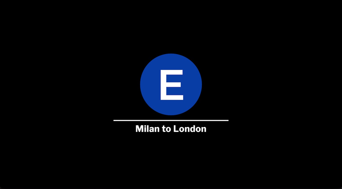
E Train
Inspired by an
MTA E Train t-shirt
I bought when I visited New York City in 2004.
Helvetica seems to be the font family used by the MTA
but I didn't have a licence for it so I opted for
Montserrat
on the train letter and
Libre Franklin
on the train route which I reckon they are close enough. Lastly I
got the actual blue colour from the
MTA brand guide.
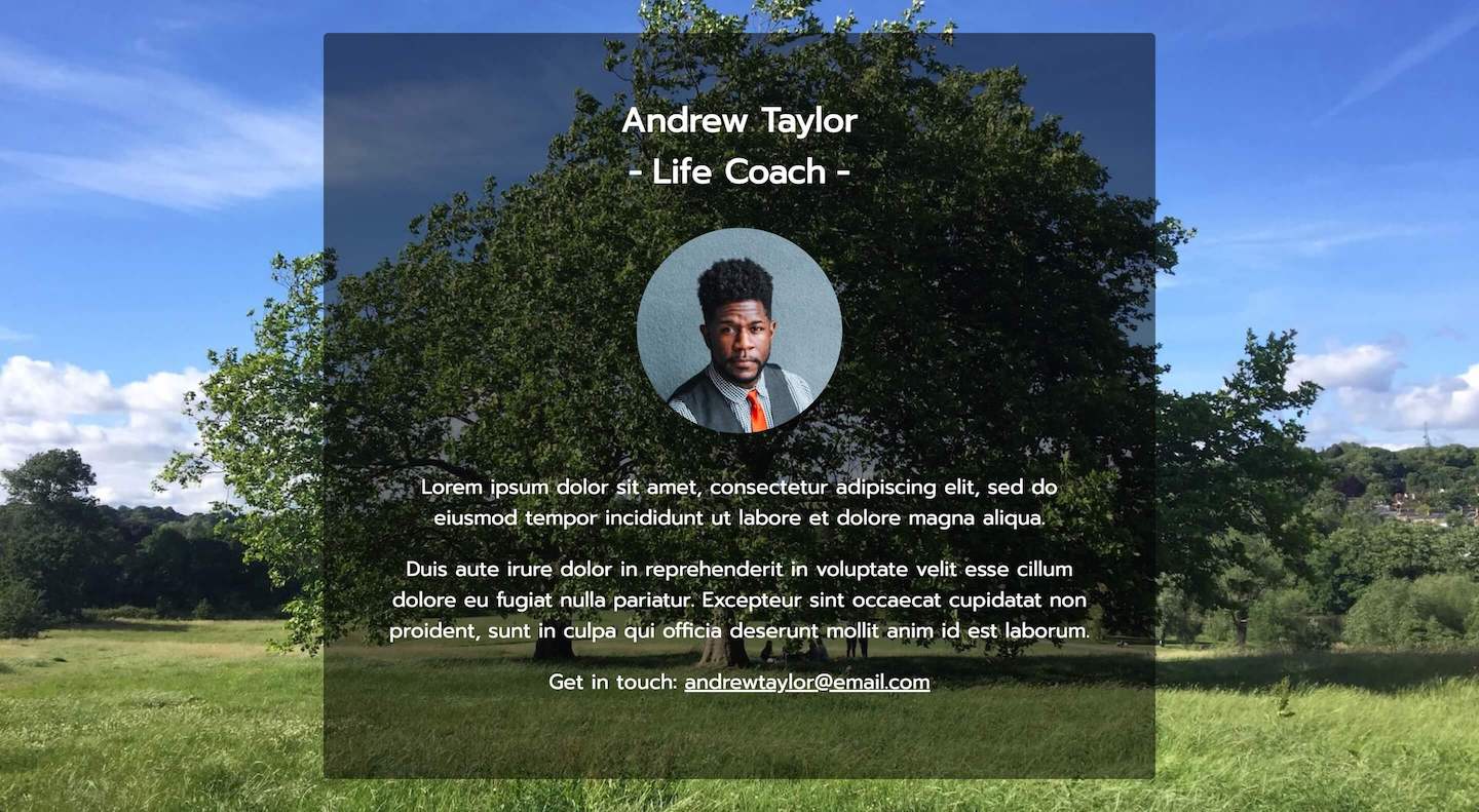
Andrew Taylor - Life Coach
A friend of mine asked me to put together a landing page for his new
life coaching business, this is its dummy version. I got the
image of the bloke from Unsplash
but I personally took the background image on Hampstead Heath.
Prompt font.
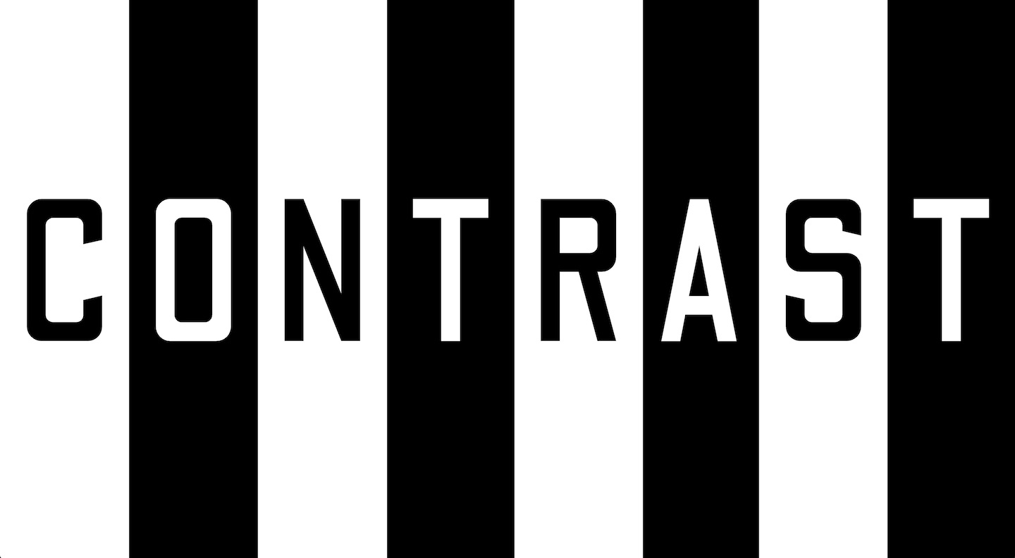
Contrast
Contrast theme with nested css flexbox rules and somehow responsive
font size.
Odibee Sans font family.
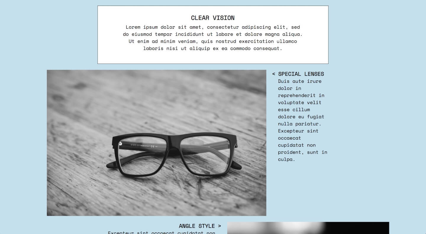
Clear Vision
Inspired by an
Eyevan 7285 advert
on an issue of
Monocle magazine. Unusual implementation of the
direction CSS property
and oversized images. Photos sourced on
Unsplash, see the alt attribute for authoring.
Space Mono font family.
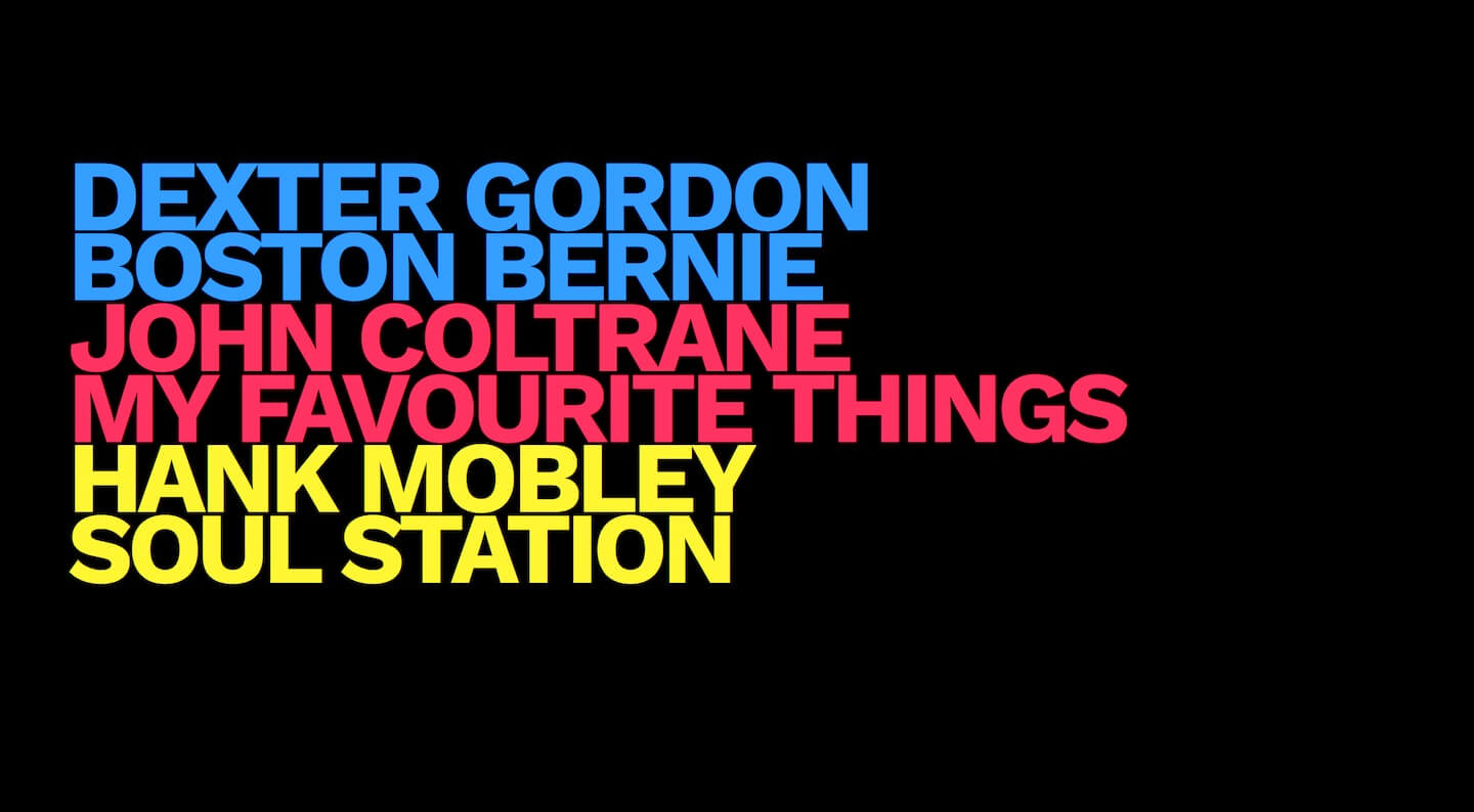
Fluorescent Jazz
I saw this design in a book whilst browsing in a second-hand shop. I
thought I would replicate it with a jazz theme:
Dexter Gordon: Boston Bernie,
John Coltrane: My Favourite Things,
Hank Mobley: Soul Station.
Work Sans font family.